Presets
Presets
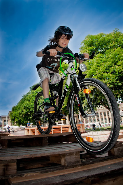 |
| Vibrant |
As I've suggested in earlier posts, once you've found a suitable motif - one that captures your fancy - then go ahead and "shoot it till it's dead". What you will then have is a collection of very similar shots and, if you're lucky, you may find all of them interesting. But your friends might not think that 77 pictures of your kid eating spaghetti are as captivating as you do.
One possible solution: presets. Most programs with which you process your pictures have presets that give your photos a certain look with one click. Just like the presets in your camera which can make your pictures extra vivid or sharp or full of contrast from the onset, post-processing presets - which you can also create yourself - provide you with time-saving steps for giving a group of pictures similar properties. For example, if you are planning to show a half-dozen pictures together, you may want them to share a similar color spectrum. Smart phones have apps that give the photos a blurry green, artsy-retro look. I'm sure you've seen them on Facebook. I am not sure why blurry green pictures are supposed to look artistic, but then there's a lot I don't understand.
Back to presets: In Adobe Lightroom or Photoshop or many other photo processing programs, there are presets available for free on the web or in magazines and they are fun to try out when you have a series of pictures you want to play around with. I even had one of mine published in the Dec. 2010 issue of Digital Photo. However, I believe the real art comes when you have your own vision and create presets for your pictures yourself.
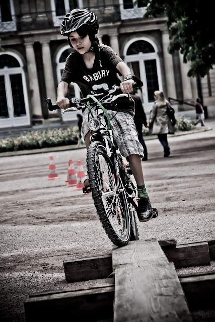 |
| High contrast |
On a sunny day at a bike fest, it seems to me that high-contrast pictures are called for, whether they have bright colors or almost none. Bikes have lots of lines and curves and they look coolest when you can see them clearly. Right?
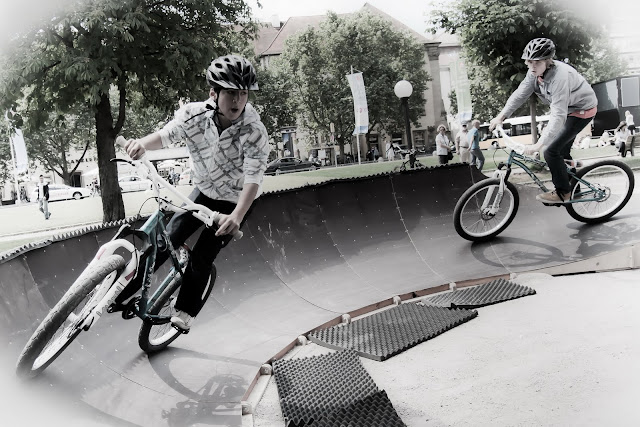 |
| Low saturation |
You may, on the other hand, want to play with the opposite of what you would normally choose and see if you feel the look and the content are in accord. It's OK if they aren't; many people will then be able to recognize it as art.
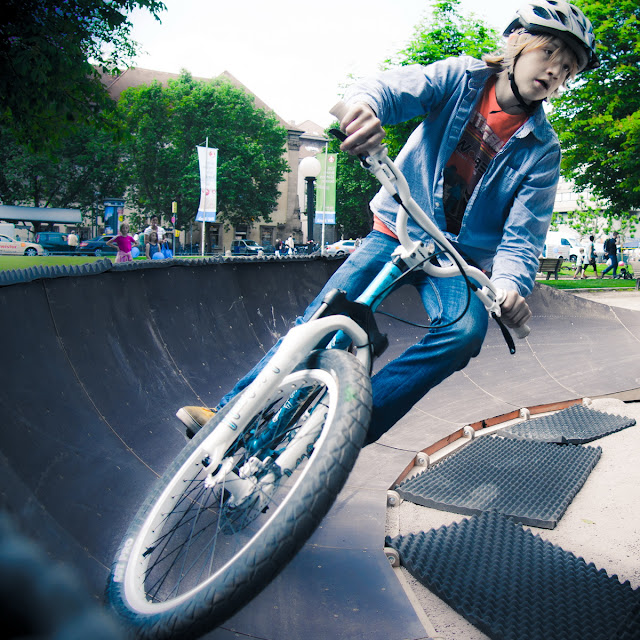 |
| Blue look |
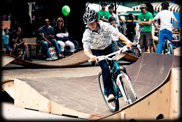
Here you see several different looks that I tried out by starting with existing presets in Lightroom and then tweaking them to my liking.
 |
| Framed |
This one, for example, had a pretty cool black frame-like vignette around it that would have taken me several minutes to create myself. Again, you can keep some aspects of a preset - the coloring, contrast, vibrancy, clarity, etc. - and change others to your suit your aesthetic sensibility.
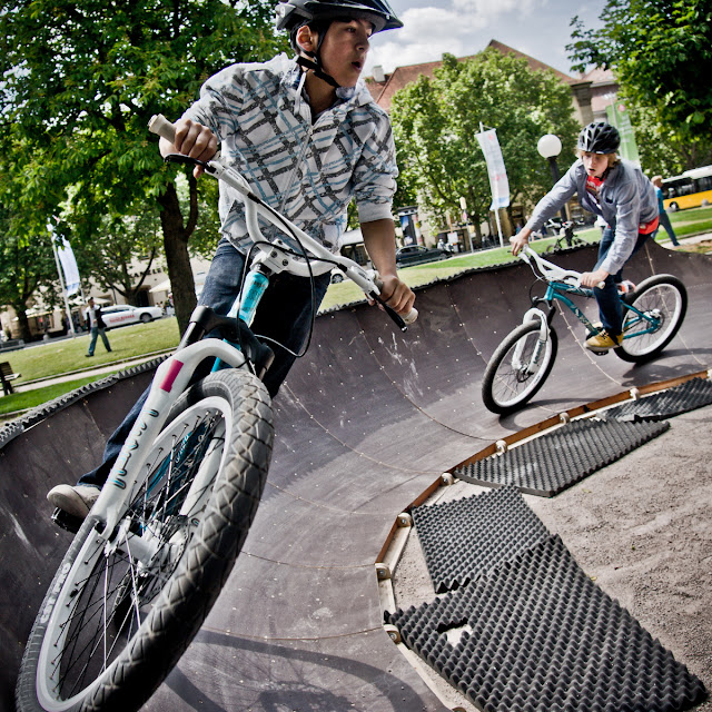
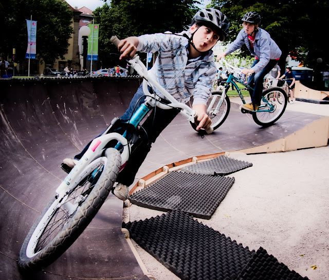
These last two pictures below have very similar contents and yet each one has a fairly different feel to it. Can you put your finger on what the differences are? Which one do you prefer? Why?
 |
| Riding high |
 |
| Riding low |


I am very much looking forward to receiving my own copy of Lightroom. Amazon was offering it recently for $119 so I jumped on it. Won't be here until the end of June, though, more's the pity. Great shots!!!
ReplyDelete